
Visual media allow researchers to record and re-present a process. However, complete documentation of any process is impossible. Be they manual or automated, important decisions are made throughout a project in order to communicate the desired evidence to audiences. Below are some tips for using visual media to document and express a research process. Through these tips, I suggest that images are more than mere snapshots of the past; they are integral to the argument being made.
Image Quality: When visually expressing a process, the quality of the image is as significant as the image’s content. It is important to pay attention to the resolution, exposure, colour, focus, and framing of images. These qualities play a significant role in the persuasiveness of the photograph. For instance, a high-quality image may hold people’s attention, allowing them to appreciate both the appearance of the image and the evidence it is presenting. The intent and attention paid by the photographer translates to the photograph and therefore to audiences. Intent and attention also influence a person’s trust in images. At the same time, experiments with quality (e.g., low-fidelity images) are opportunities for researchers to comment on visual documentation as a form of mediation or construction. Post-production especially accentuates the construction of images. During post-production, many aspects of a photograph can be altered using an editing tool such as Photoshop. These tools modify colour, reframe through cropping, remove dust, and also brighten. “Curves” and “Selective Colour” are two Photoshop tools I use often. “Curves” allows you to brighten or darken an image by dragging anchor points up or down the “Curve” line. “Selective Colour” lets you modify images that have a colour cast (i.e., an often unwanted tint affecting the entire image).
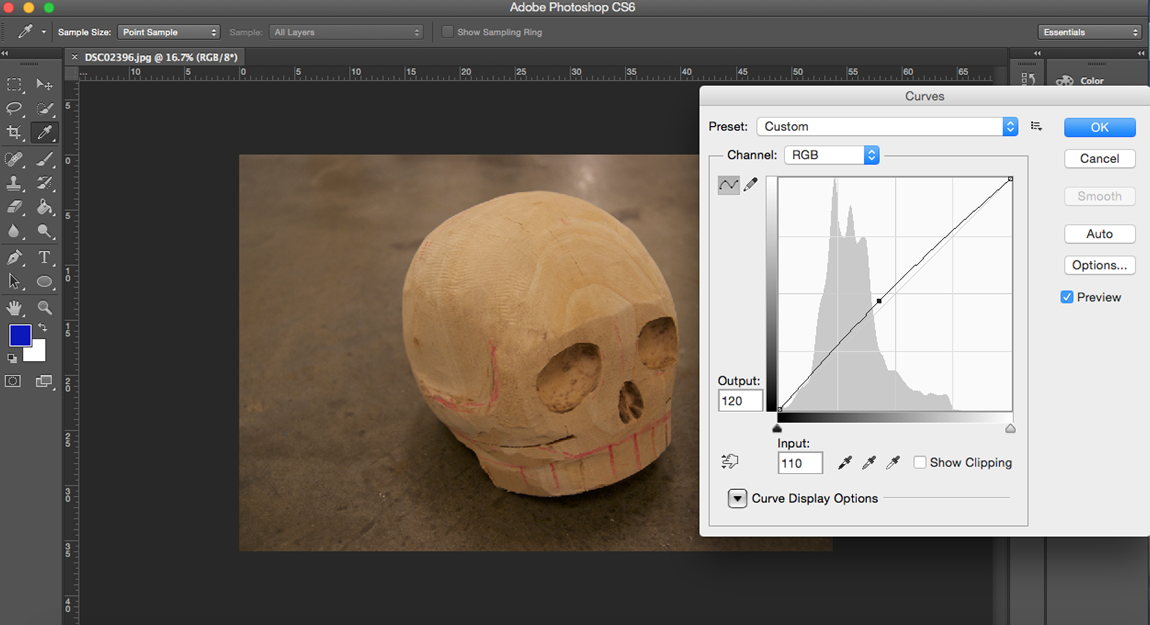
Image care of Nicole Clouston and the MLab
Surroundings: While documenting a process such as prototyping (something we do often in the MLab), try to be aware of everything in the frame. Audiences will consider any object in the image—even objects in the background—a part of the content. Also keep in mind that some contextual objects can be helpful. A prototype beside the tool used to create it, or all composite parts of a prototype laid beside the assembled finished object, can help audiences better understand process. If you are documenting an interactive piece, then a photograph of someone engaging it can provide necessary contextual information about its scale and function.
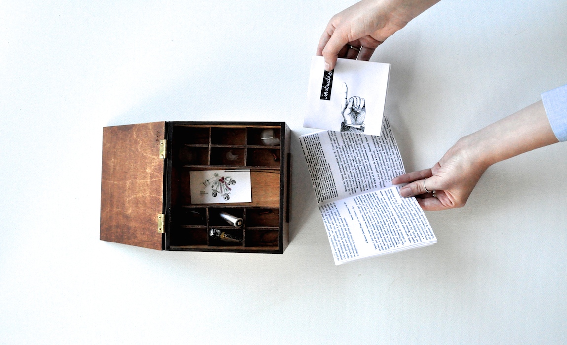
Image care of Danielle Morgan and the MLab
Design: Image placement shapes the arguments you make with visual media. The design may complement the actual process, or it may represent an ideal process. Scale creates a hierarchy, with larger images typically viewed as more significant. Their position within the design also alters how they are interpreted. For example, a design that depicts a process in a linear grid, with each image the same size, may convey a procedure or chronology while also arguing that each step is equally important. In contrast, a design with the finished prototype in the center, and process images radiating from it, may suggest that the product is more important than the process.
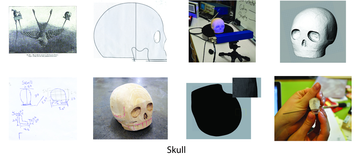
Image care of Nicole Clouston and the MLab
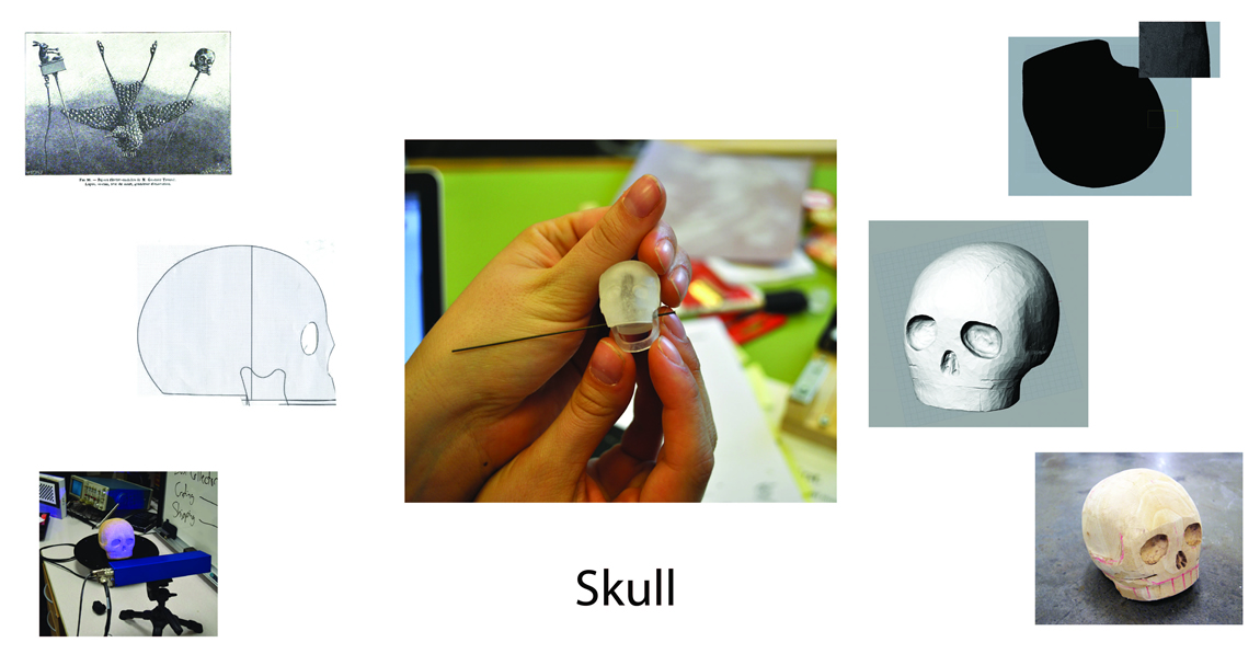
Image care of Nicole Clouston and the MLab
Text: What text is included, not to mention how, are other important considerations. Unless it is an HTML “img alt” attribute describing images for people who listen to the web with screen readers, an in-depth textual explanation of an image is often superfluous. Too much description may stop audiences from investing time trying to understand images for themselves. An alternative strategy is the use of captions (under individual images or under the entire design). Captions provide a concise amount of contextual information to audiences, aiding their understanding of what is being depicted while still encouraging their own investigation (see example below). Your choice of typeface or font also influences the audience’s interpretation. The most convincing font choices allow audiences to focus on the message being communicated rather than the typeface used. The choice of font can be driven by the content of the medium, such as the use of a Victorian-inspired typeface for Victorian era content. This approach can be employed persuasively, but it often distracts audiences from the actual content of the text. In my own experience, I have found that the most effective approach is to choose a simple font that is easily read at the scale the image is being shown. Also, keep in mind that serif fonts are generally easier to read in print, and sans serif can be a better choice for online reading.

The skull model for the Trouvé pin, carved by Nicole Clouston, resting on the servo-driven turntable. The HDI 120 3D scanner uses structured-light, blue-LED technology to take high resolution images of the object as the turntable spins. Image care of the MLab.
Attribution: When presenting images it is important to include attribution. Who made it? Who is pictured? How is it licensed (e.g., Creative Commons license)? You should also get signed releases or permissions for images, where applicable. One strategy for presenting attributions in a manner that works with, rather than against, the design is to incorporate them in a manner similar to the rest of the textual information. In the poster below, information was given in text blocks with headings. Following this design, attributions fall seamlessly under the heading, “Team.” When presenting images individually, a caption is often an effective way to give attribution. If the image is circulated via a website or repository, then the domain itself may have licensing and attribution information that applies to all content.
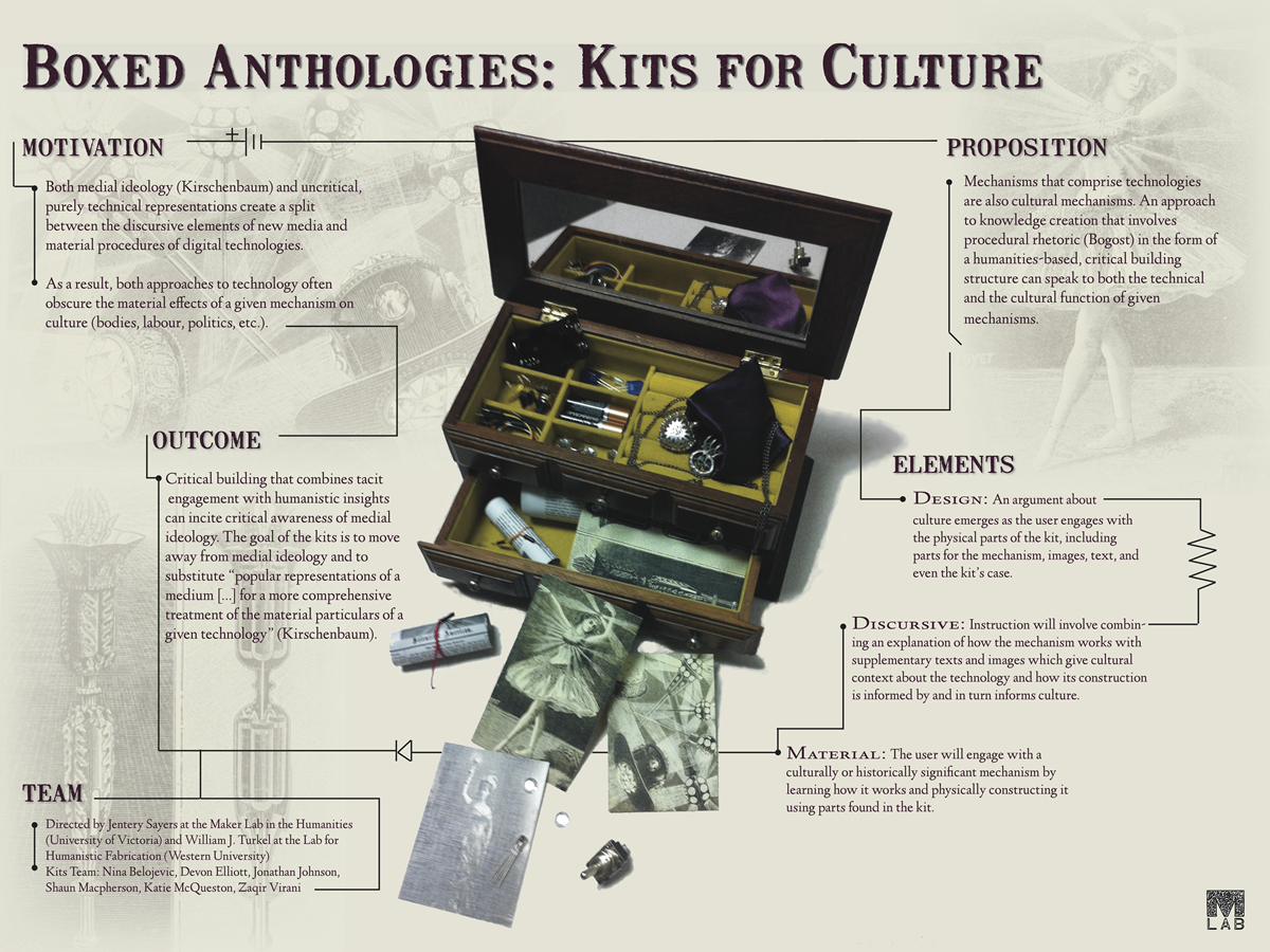
Image Care of Nina Belojevic, Shaun Macpherson, and the MLab
Medium: Among many options, visual documentation can be posted on a website, published in a booklet, and printed on a poster. Each of these media has particular strengths and connotations. Of course, people often combine approaches. Consider how you want audiences to experience the images and ultimately how your images function in relation to the process, product, and project. Odds are you will want your choice of media to complement the process depicted as well as the context in which the materials are displayed. Below are more details for using the web, posters, and booklets as visual media.
Online: Presenting images online via a blog or open repository may give viewers insight into your process as you are working on it. This form of documentation and circulation allows people to follow what is happening over time. Images online may also be accessible to a large audience who may not see the work in person. Online circulation may also increase the odds of people serendipitously discovering your work. If you publish your images online, consider whether you want to publish high-resolution versions. The resolution of your images may correspond with not only how you want others to use them but also what you are saying about the current status and applications of your research. Depending on the project, you may also want to consider restricting online access to your images, or keeping (some of) them offline altogether.
Poster: In tactile form, a poster brings digital images off the screen, allowing them to be presented alongside exhibited work. Showing audiences how the piece came to be, together with information about the decision-making process, will shape how they encounter your research. The way the poster is displayed may also complement the work. Here, you might want to construct relationships between the poster, the scale of the piece, its shape, and how the various elements came together. For example, a poster for a modular piece could be composed of articulated print elements, mimicking the way that piece became a cohesive whole. Also, if you are making a poster for a specific space, then—where possible—visit that space prior to mounting or installing the poster. This way you can get a sense of the space’s layout, acoustics, lighting, and capacity, all of which may affect how people interpret the poster.
Booklet: For many audiences, a booklet presented with a piece may be the most intimate and accessible experience of images. This approach may be especially appropriate if you are hoping to include sections of text or research alongside the images. In contrast to reading a poster (which can be awkward), a booklet is an approachable format to read. Audiences may also spend more time with it, and it may be placed with the piece, making it something people will likely experience after the piece itself. Booklets are often printed in multiples. Presenting more than one booklet with the piece allows several audience members to experience the documentation at once. The booklets can also be take-away items, or they could be mailed out, allowing for broader dissemination. The number of booklets that should be printed will depend on how you plan on using them. In my experience, when presenting in an exhibition context it is ideal to print fifty booklets if they are being given away and ten if they are not. Having extra copies to archive or replace damaged booklets is also useful, but I would caution against over-printing. Having a large stack of copies may prompt the audience to treat the booklet as disposable or insignificant.
Image care of Danielle Morgan and the MLab
By being attentive to decisions made along the way, visual media can be a very persuasive approach to expressing your research, giving audiences a rich understanding of the composition process and supporting the argument you are making.
Post by Nicole Clouston, attached to the KitsForCulture project, with the fabrication, physcomp, exhibits, and versioning tags.